About this project
- September - December 2017
- 2 UX Designers and 1 Visual Designer
- UX Designer
- Academic project
Socialaza is a social networking app helping users find and participate in events posted by other users in the app. Users can sign up for events happening nearby based on their interests. The app uses Facebook credentials to authenticate users. Users see recommended events posted by their second and third-degree Facebook connections.
Defining the problem
For this academic project, we had been provided the following brief: “Develop a system/solution that focuses on enabling positive social interactions in the digital or physical (or both) space.”
During ideation, we considered and discarded several ideas, like co-parenting, social gaming/entertainment, and remote shopping. One theme that resonated with the whole team was “travel and shared experiences”. We started telling each other about our travel stories and past experiences, both positive and negative. In all the stories, what stood out was the desire to visit new places “like a local” and how that can elevate a travel experience from ordinary to memorable. We also talked about how our travel itineraries often can be restricted by our travel companions’ interests and how we may not always get to do or see everything we want on a trip.
Thinking we were onto something, we polled our classmates to get first impressions on our idea. We received positive feedback about this idea from our classmates. The discussion with the larger group also led us to include day-to-day activities like going to a football game or trying a new restaurant. We decided to frame our design problem using the following “How-Might-We” question:
How might we enable people to find social companions for activities and events of their interest?
User research
Our UX research spanned across 3 weeks and included various research methodologies, both qualitative and quantitative.
Market research
We conducted market research to find similar applications that exist in this space. Of the thirteen applications we reviewed, most were in the travel domain, offering local tour guides for tourists. A few applications existed in the movies/workout domains, but they did not seem very popular or robust.
Survey
Next, we wanted to understand what types of activities people would be comfortable taking part in with strangers as companions. We decided to gather some quantitative data on people’s attitudes and interests about various types of activities related to travel and daily tasks. We also gathered demographic data in our survey to capture any demographic factors that affected people’s attitudes about participating in activities with strangers. We ran the survey for a week and received 134 valid responses. Based on the survey data, we learned that users were not comfortable participating in activities like shopping, going to bars, and getting groceries with strangers.
Other insights from the survey included:
- People are comfortable with unknown persons showing them around the city.
- The average willingness for most activities was around 3 on a 5 point scale, but certain activities like shopping and workouts stood out as many participants were hesitant to do these with strangers.
- Activities involving lesser social interaction between companions were preferred over the others
In-depth interviews
To gain some qualitative insights into our survey findings, we conducted in-depth interviews with 6 participants over 10 days. The primary goal of the interviews was to understand why certain activities had a higher willingness rating than others in the survey. We also wanted to know if users had any concerns about feeling safe with or trusting strangers with whom they would participate in activities. If this were the case, we wanted to learn how we could help alleviate some of those concerns with our design.
What we learned from the interviews:
- Since activities like shopping and getting groceries may be largely influenced by personal preferences & dietary restrictions, participants were uncomfortable with strangers being involved in these activities. Most participants stated that they only go shopping with people who they know very well and whose opinions they trust.
- Participants were comfortable with the idea of being shown around a new city by a stranger but were also concerned about the person's credentials.
- 4 of 6 participants mentioned that they would visit the profile page of their co-participant(s) to look at previous ratings, reviews, and try to gather any other information that would help them feel more comfortable meeting up with that person.
- 2 of 6 participants mentioned that they would not pick a tour guide unless they were able to make sure that the person was a "true" local and had experience with tours.
- Credentials are important for adventure sports as well. 4 of 6 participants mentioned that they would feel safer participating in an adventure sport led by someone who had already done the activity a few times.
- Participants were moderately comfortable with going to new restaurants with people they didn't know well but had concerns around the compatibility of food preferences and dietary restrictions.
- 3 of 6 participants were also wary of the experience feeling "date-like" and leading to potential awkwardness.
Research synthesis
To make sense of our user research as a whole, the team decided to conduct an affinity mapping exercise. We pulled out key insights & user quotes from both the qualitative and quantitative research to find commonalities and themes across the research.
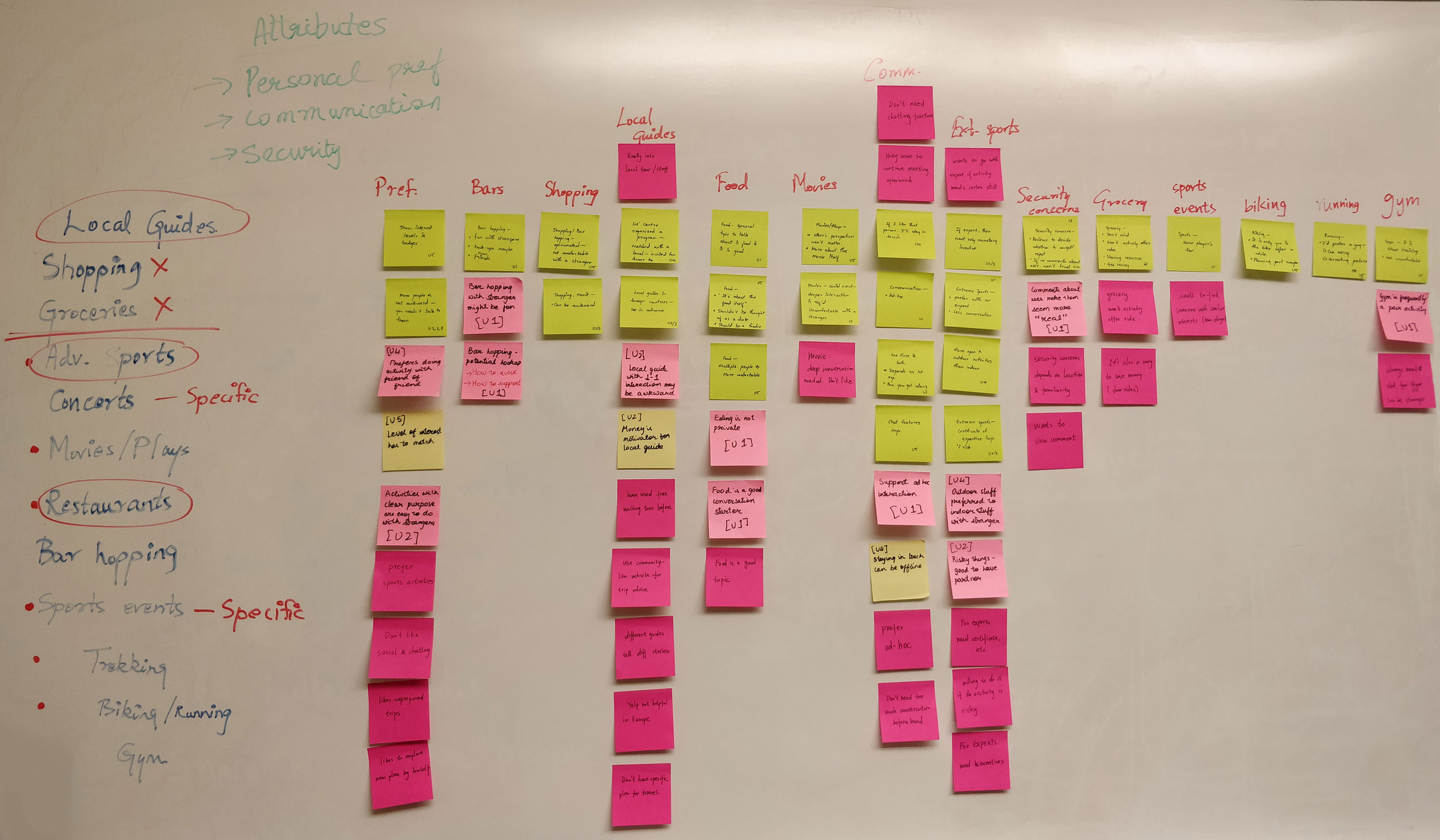
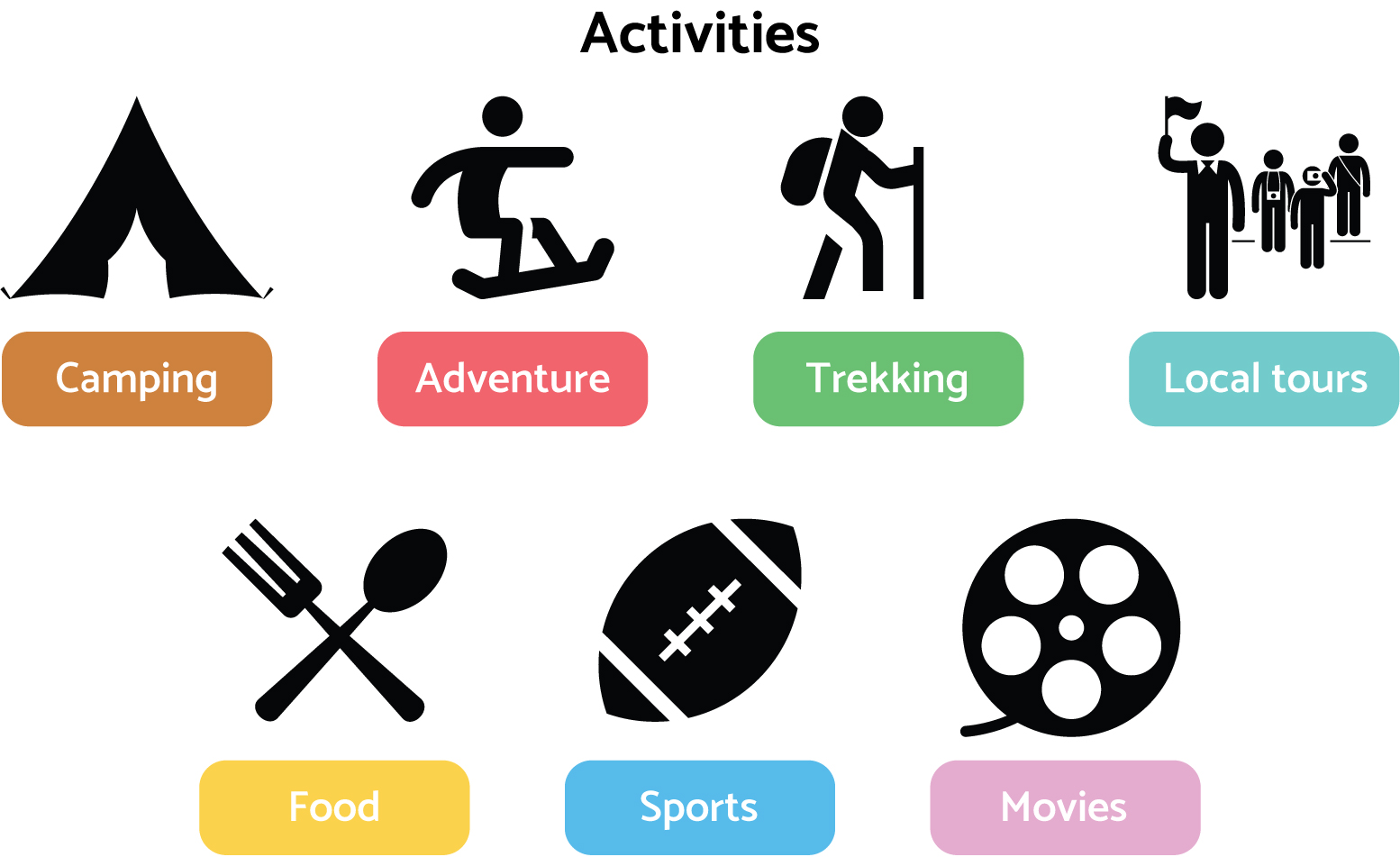
Based on our analysis, we decided to include seven types of activities in the application - camping, trekking, local tours, adventure sports, food, sports events, and movies. We also defined & refined specific features of the application that participants had called out as critical.
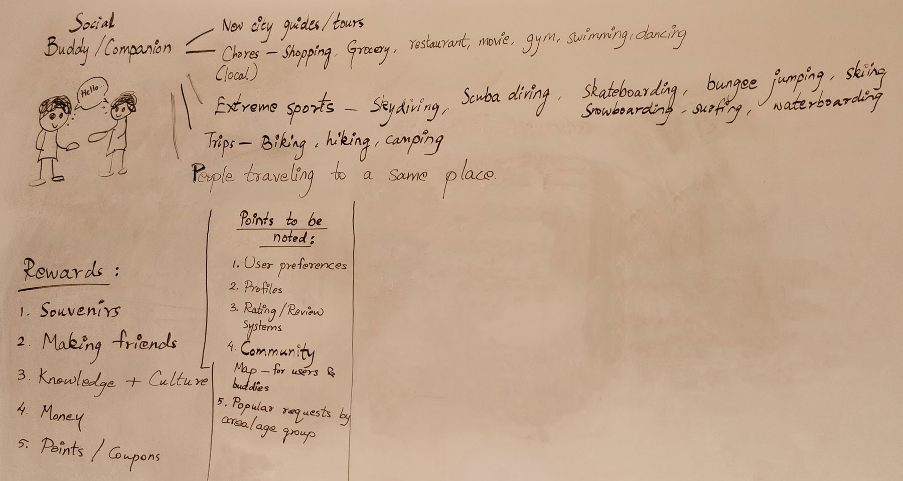
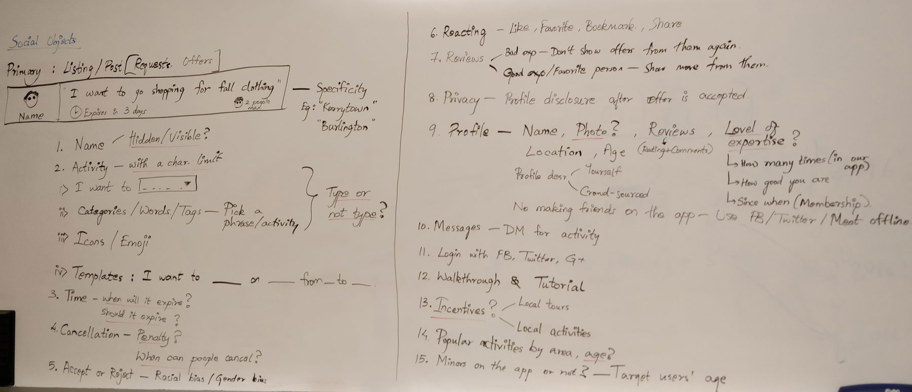
We decided to design & build out the following sections in the app
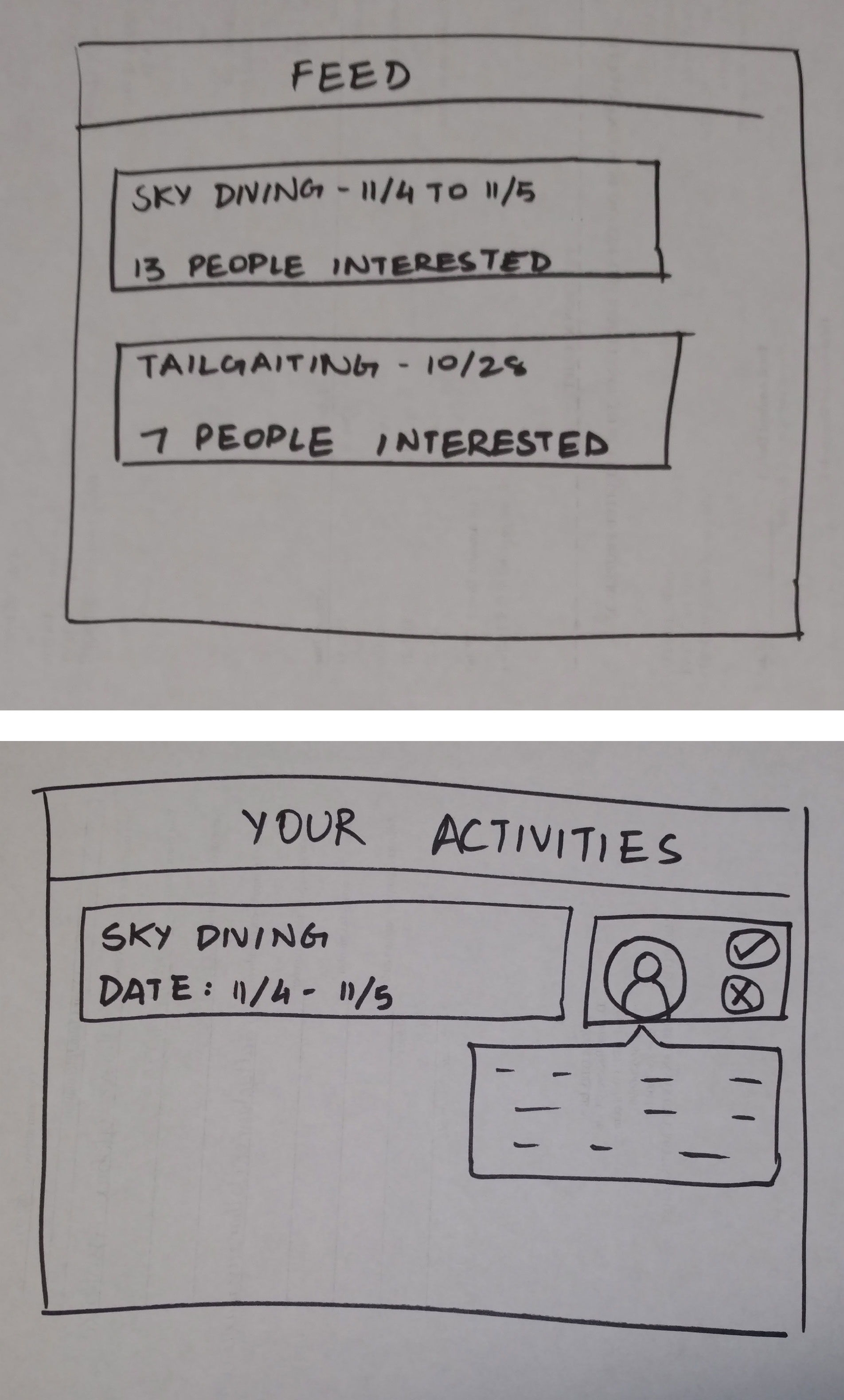
- Feed - see activities in your area
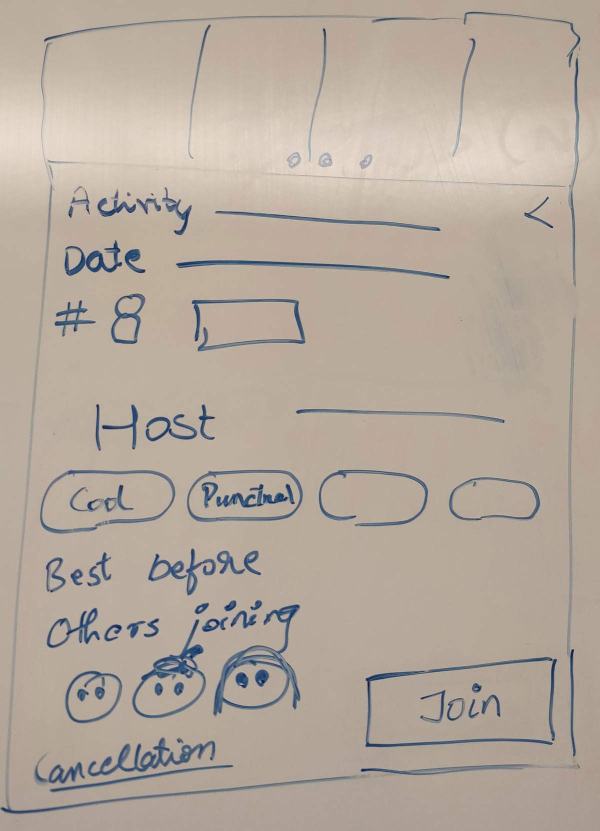
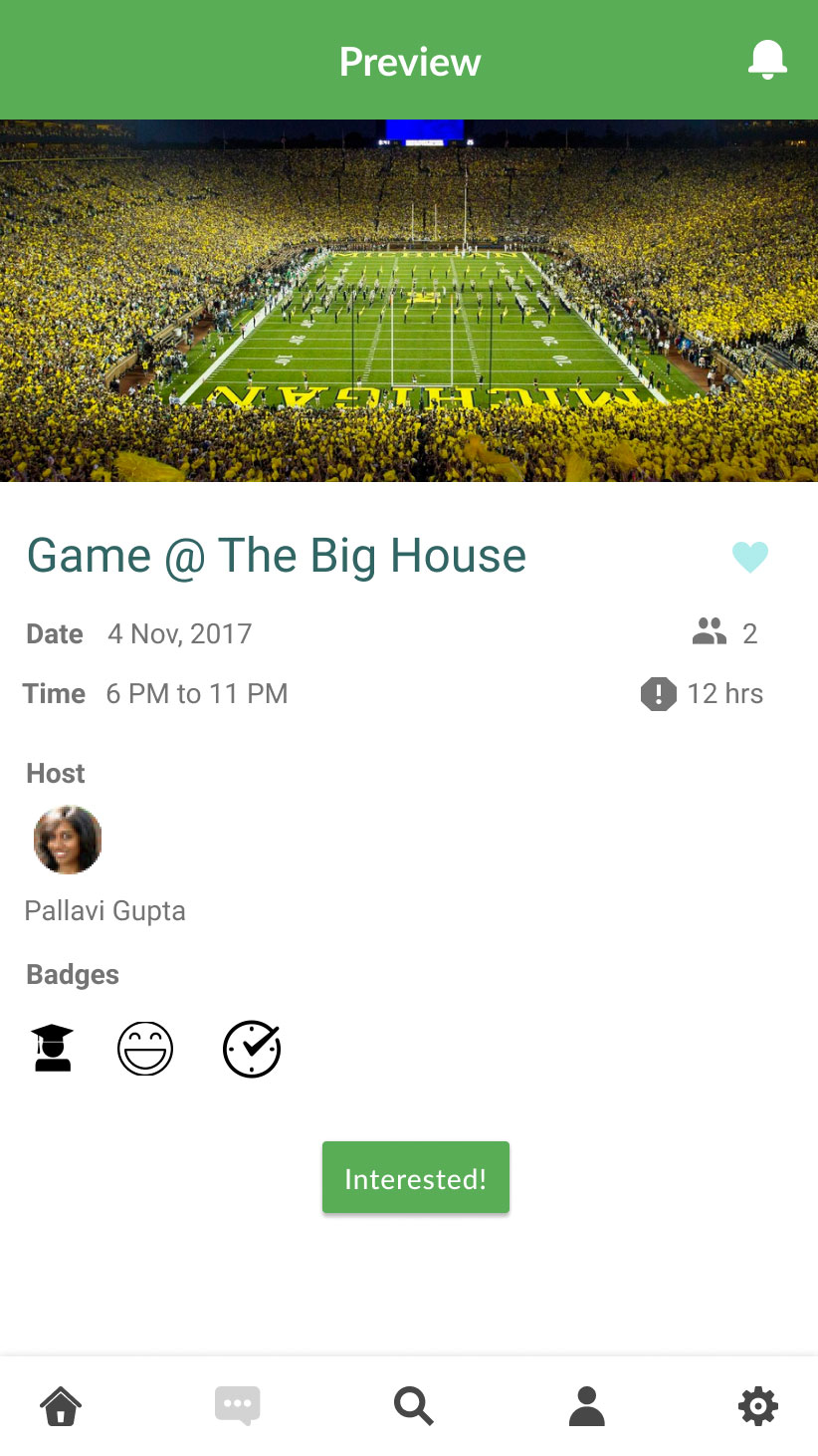
- Activity page - view details about when, where, who
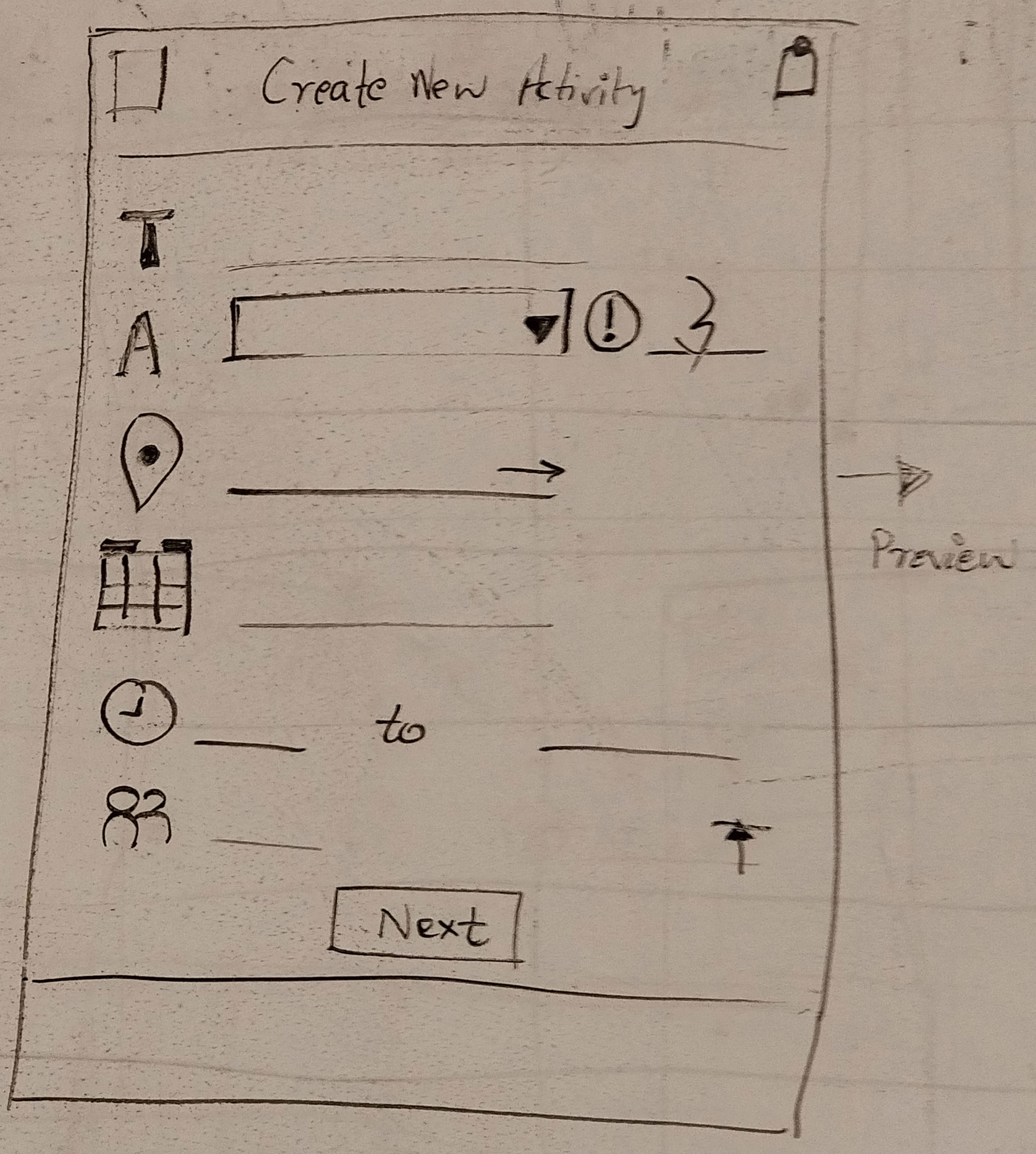
- Create an activity - What, when, where, how many
- Reviews/Ratings - No text reviews; badges instead of stars
- Profile - View upcoming/past activities, badges
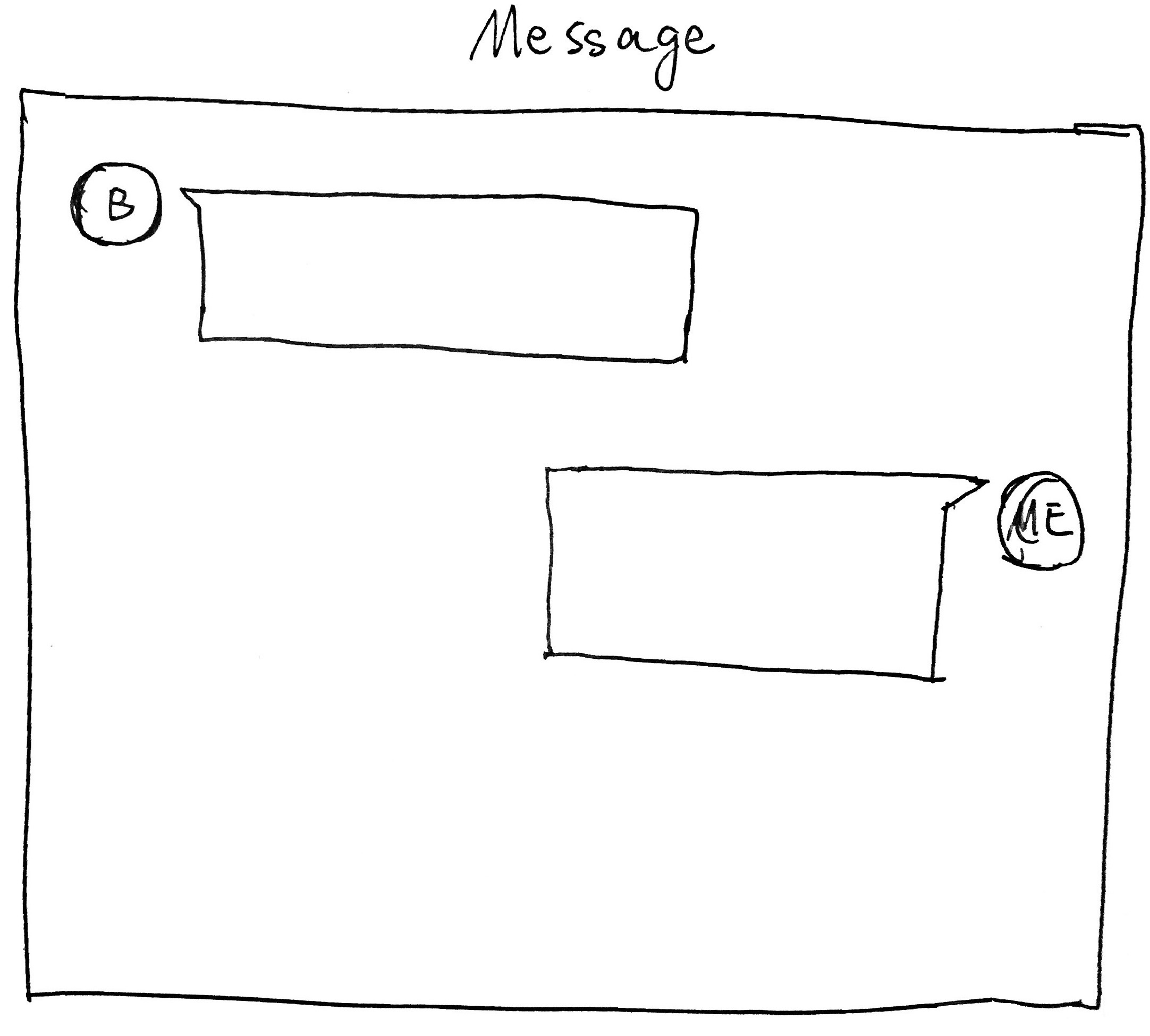
- Messages & notifications - pre-event communication with group/co-participant
Design iterations
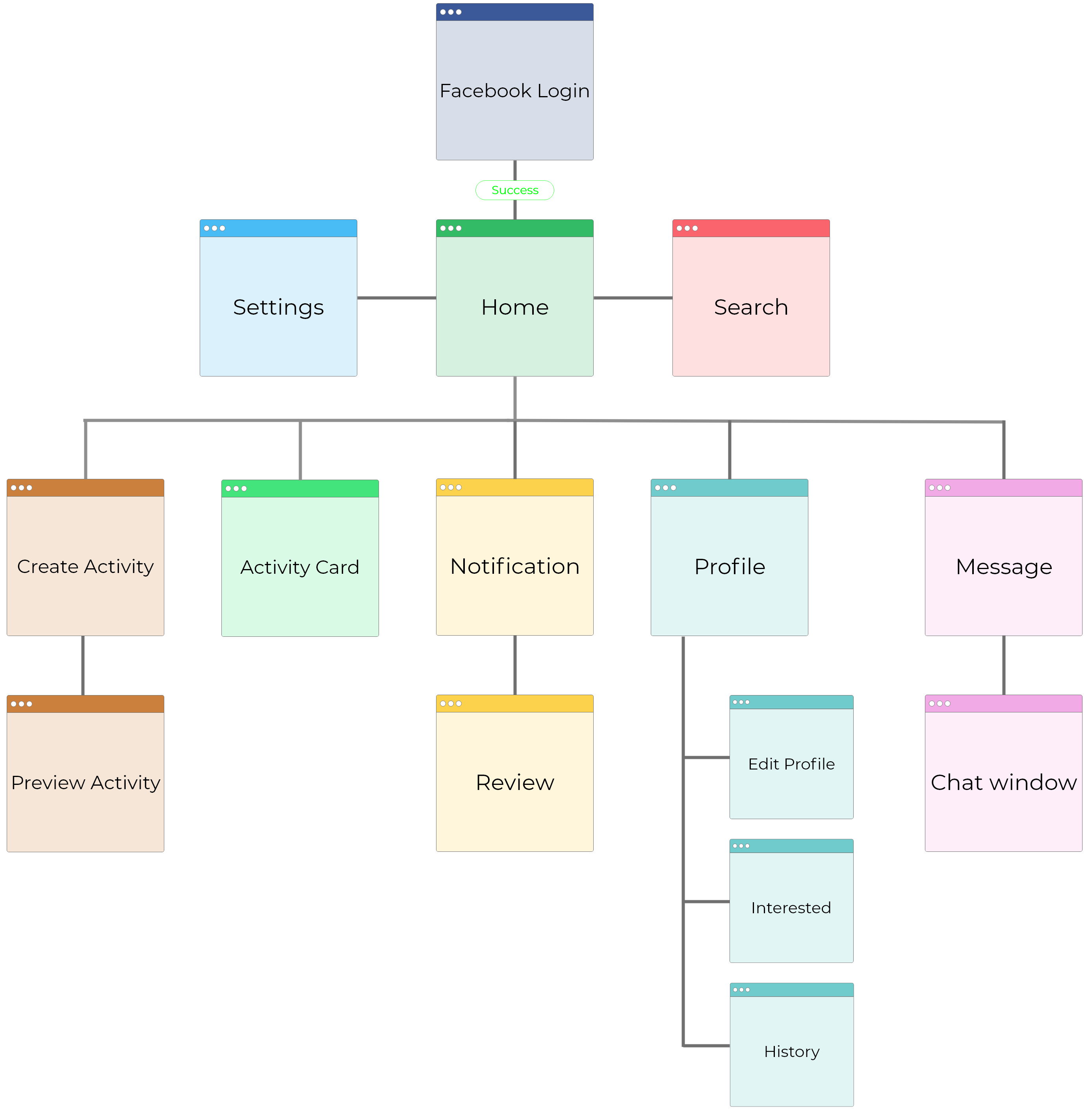
After identifying the high-level sections within the app, we created a site map that also served as a starting point for wireframing & prototyping.
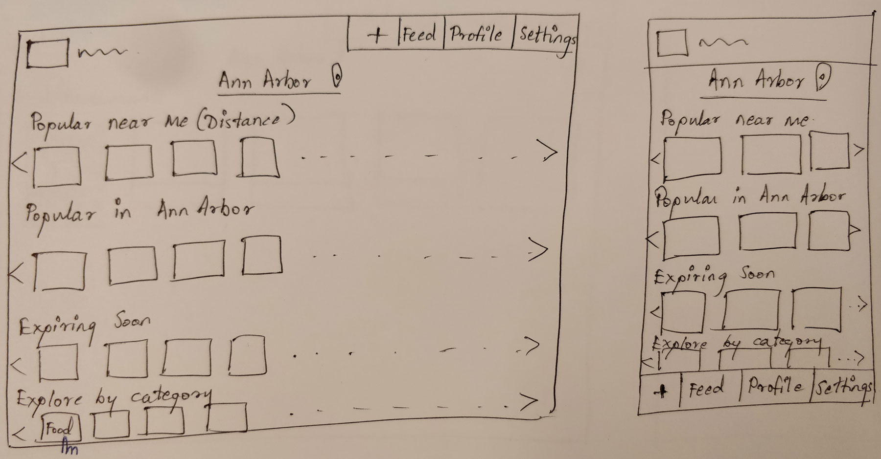
Wireframes
We then went through three stages of sketching and wireframing. At each stage, we evaluated the design against our user research insights and also went through multiple design critique sessions with fellow classmates.
Low-fidelity mockups
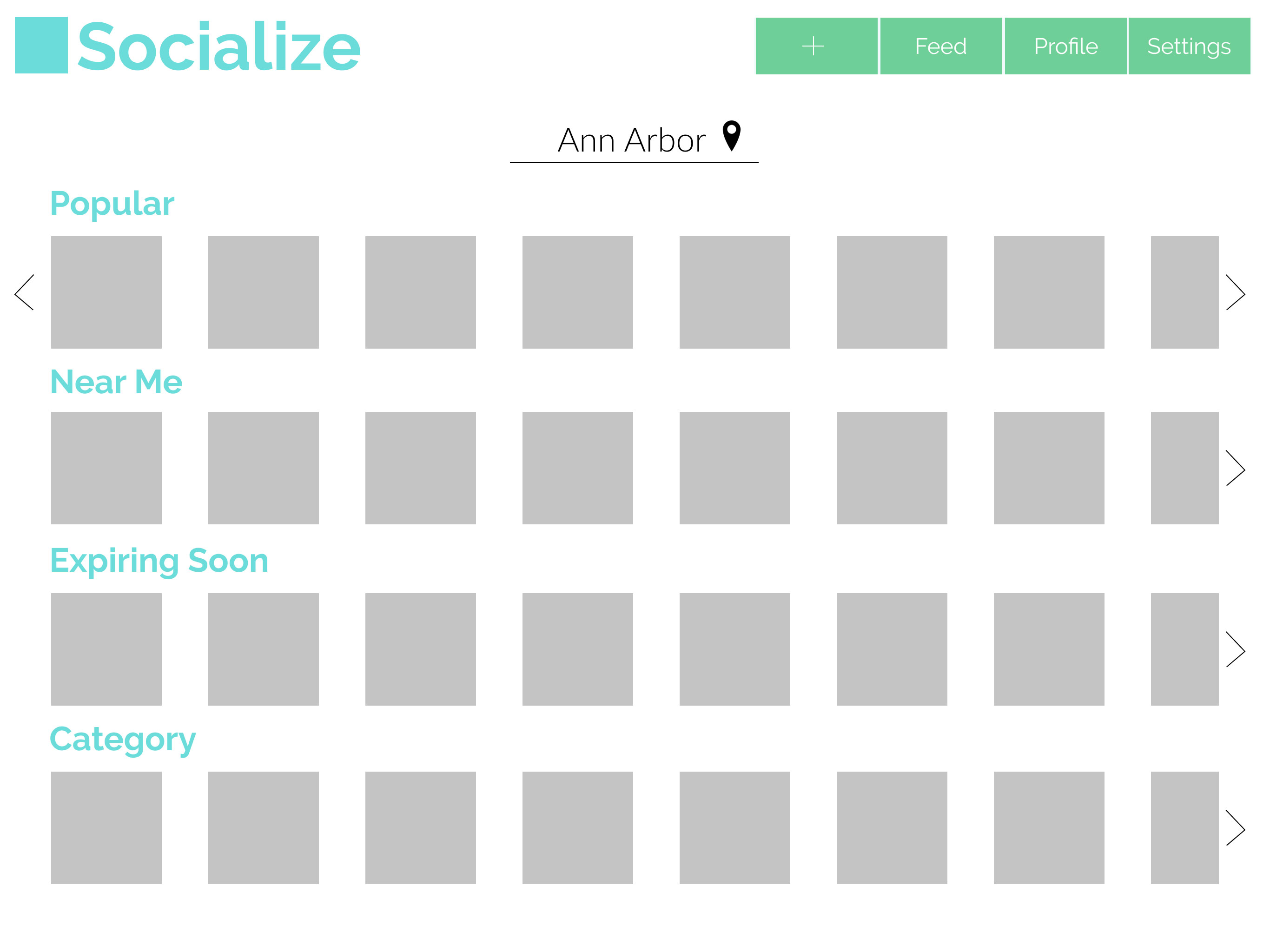
After sketching a few ideas, we had a good sense of what would go on each screen and where. We moved on to creating low-fidelity mockups using Figma, so we could better visualize what the screens would look like.
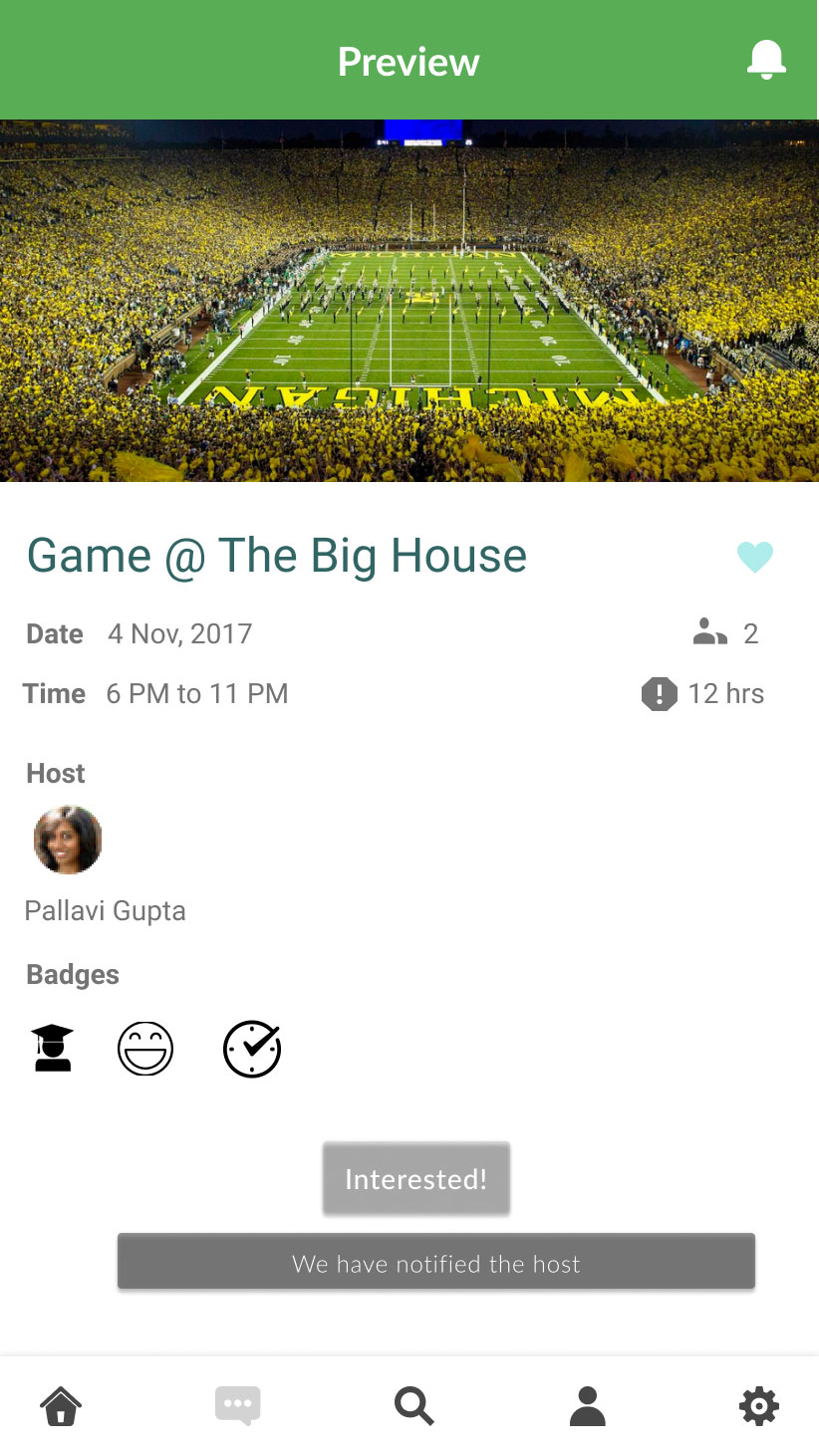
High-fidelity prototype
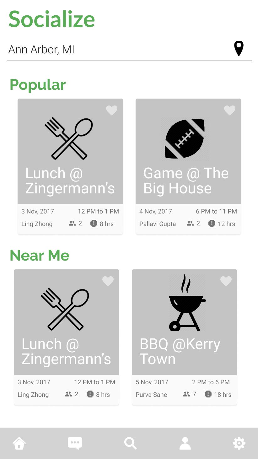
For our high-fidelity prototype, we divided the 18 screens between the two UX designers. The visual designer created our logo and other visual assets that would be used across the app.
We used Google's Material design guidelines to guide and inspire the aesthetic of our app and ensure consistency between the screens designed by different team members. We worked both individually and collaboratively using Figma.
I specifically worked on the homepage feed & profile pages.

On opening the app, a user would see a list of activities in their city, with the popular activities displayed first. Each activity card shows the activity name, date, time & group size as well as the poster's name and the signup deadline.
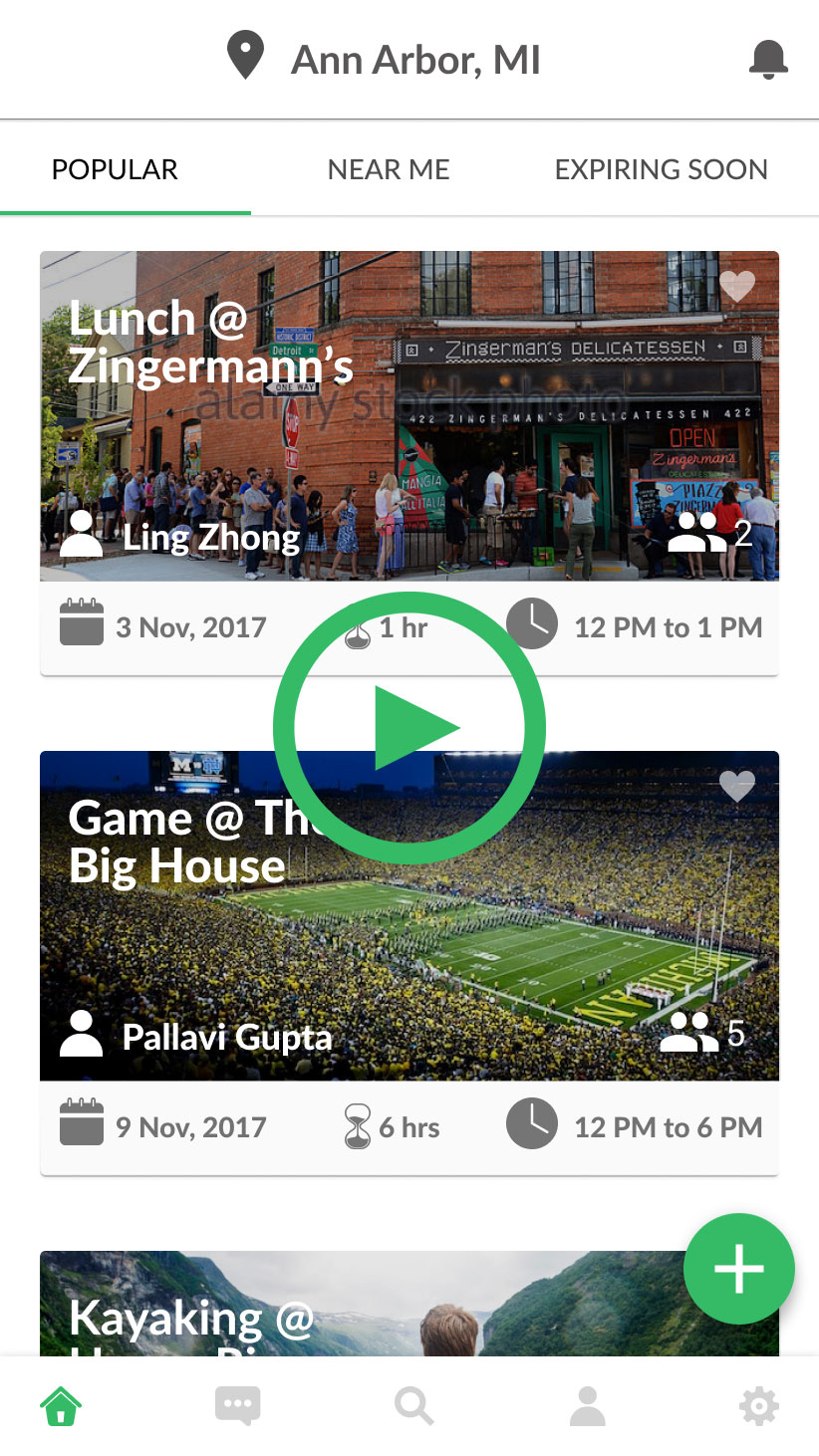
We chose the Tabs component from Material UI to categorize the different types of activities. Also included were categories like "Near me" which would sort the list by distance, and "Expiring soon" which would sort by the signup deadline.
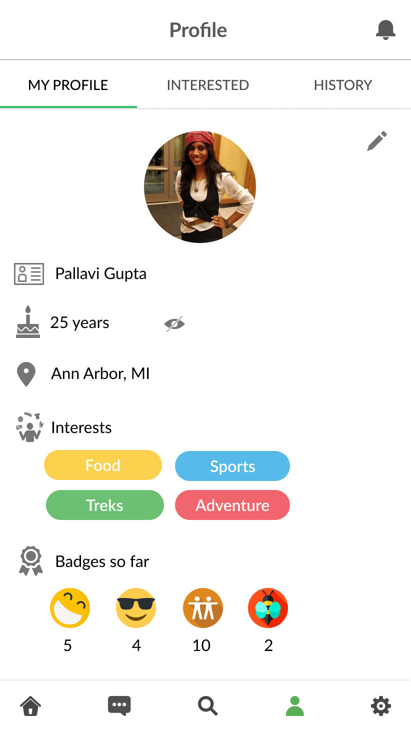
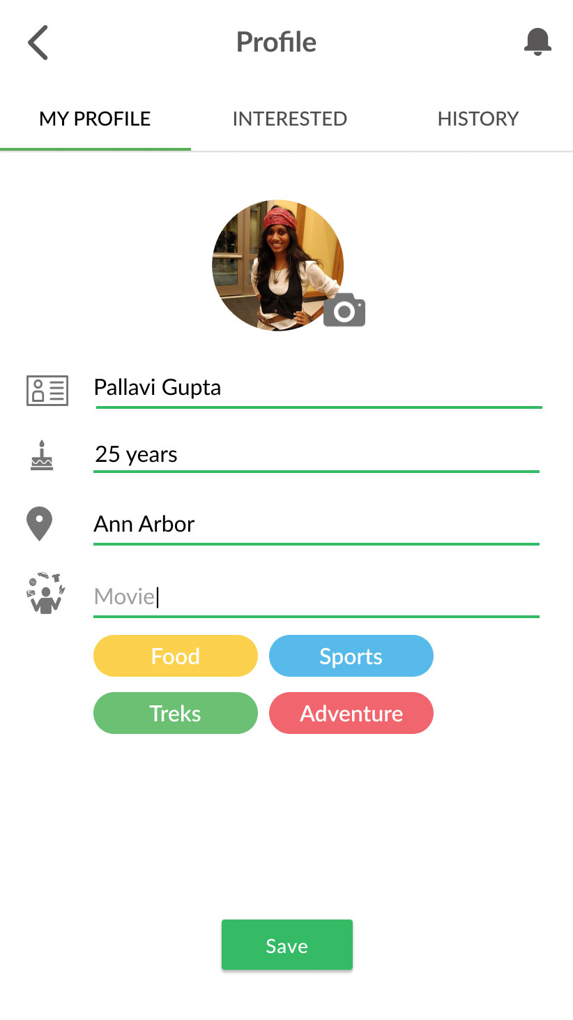
On the profile page, a user could view their profile information, profile picture and the badges they had received. In edit mode, a user is able to update their profile information and select additional interests, which would update the homepage feed with new activities.
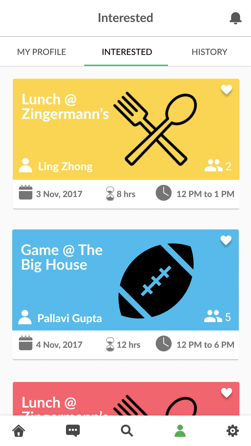
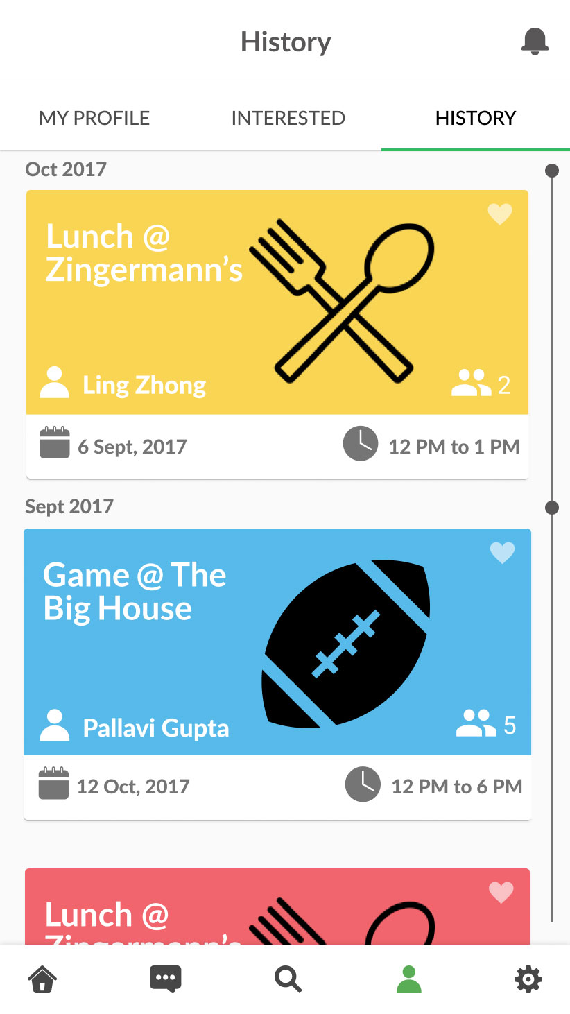
Under the profile section, a user could also view events saved as favorites, and past events they attended.
Visual design
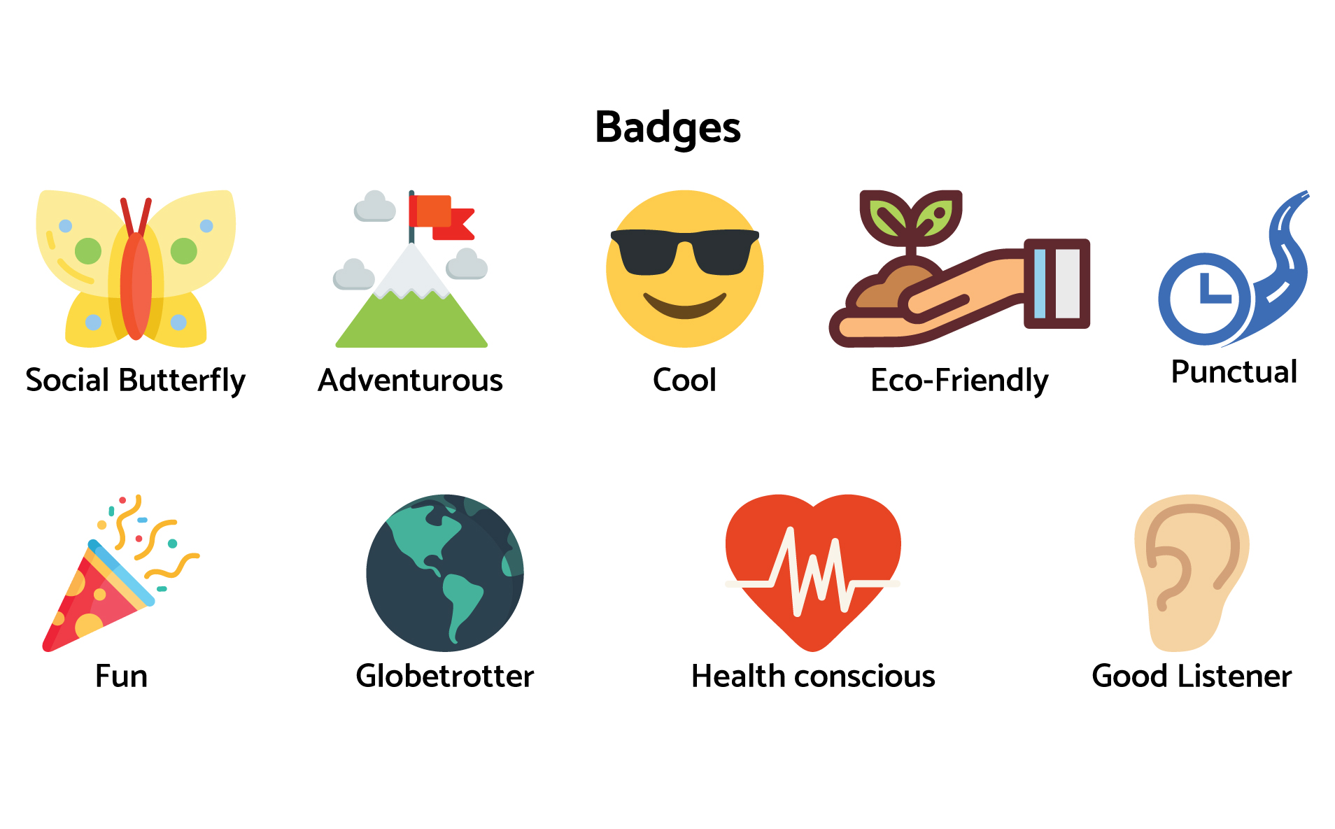
The visual designer created a unique identity for each type of activity - a default icon and color. These activity colors were used throughout the app, as a placeholder card background if there was no user-supplied image, and in the profile section under interests. She also created fun and engaging badges for our review system, so users could show appreciation to their fellow participants.
Final prototype
Lessons learned
- Take an MVP approach to product design - Time is a crucial resource while shipping an end-to-end product. It's easy to get caught up in making pixel perfect designs, or wanting your product to have all the features when you ship it, but the end goal is to have the product ready by a certain deadline. It is important to start with the critical functionality of the product, and then scale up to include "nice to have" features at a later date.
- Many heads are better than one - Get feedback from as many people as possible. Everyone will have a different perspective and listening to other people's opinions can help to validate your design or challenge your biases, and generally lead to a better designed product.
- Privacy & security concerns - Users of social networking platforms are very aware & concered with ensuring their information is kept safe, and their online activities are secure & enjoyable. Lack of privacy, security, and accountability in a social networking platform can have serious implications in the real world, if they are not appropriately addressed in the product strategy & design.
Socialaza
An app that connects you to your second and third-degree social network connections and facilitates shared experiences.