How can we improve the user experience of the PlantingScience website for teachers and give them more control over student accounts and projects?
PlantingScience is an online mentoring platform serving middle- and high-school teachers and their students by providing online mentoring support and online resources for student-led, plant-science investigations. Student projects on the website required intense back-end administrative setup and monitoring. A simpler, more intuitive system that gave more control to the teachers and early-career scientist mentors was necessary to reduce the need for training and eliminate administrative bottlenecks.
Duration:
May 2017 - August 2017
Role:
UX Researcher, UX Designer
Some of the recommended changes were immediately implemented by the development team as they were minor usability fixes like changing the text color, rearranging form fields, and adding filters in the mentor gallery.
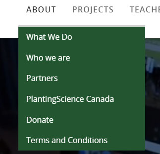
Improved contrast between text and background in main menu
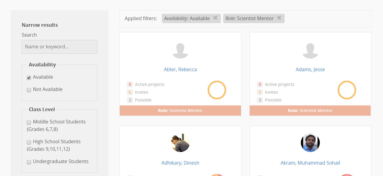
Redesigned mentor gallery with filters
We also created low fidelity mockups to demonstrate changes to the process of creating student accounts and groups. After testing the mockups with users during the usability tests, these changes were implemented on the website.
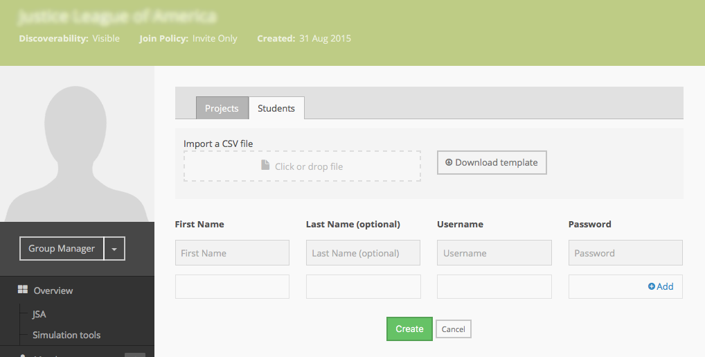
Sample of student account creation page
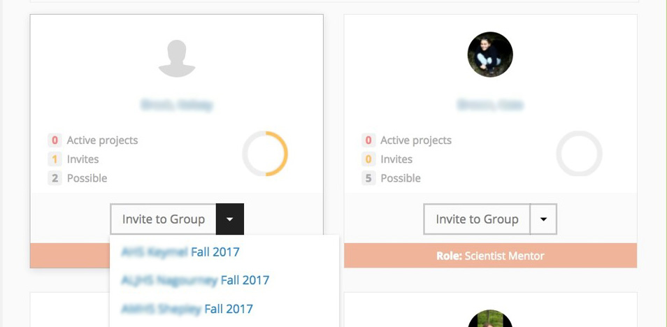
Invite button on the mentor gallery page
As part of my summer internship with the Science Gateways Community Institute, my colleague and I consulted with the PlantingScience team to improve their website PlantingScience.org. The PlantingScience staff wanted to understand how they could automate some of the backend administrative tasks needed for setting up a project and therefore be able to support a larger community of teachers. We conducted a walkthrough of the process to understand how it currently works and identify areas for improvement. We also performed comparative analyses and heuristic evaluations to identify usability problems and understand industry conventions for certain features on their website.
We then conducted usability testing using mockups for a redesigned website with new and expert users of the website.
We began by analyzing the steps involved in successfully setting up student groups and an online project space for teachers, students, and mentors to interact with each other. Our workflow analysis identified critical barriers and problems in the process which make it more time-consuming and cause additional administrative burden.
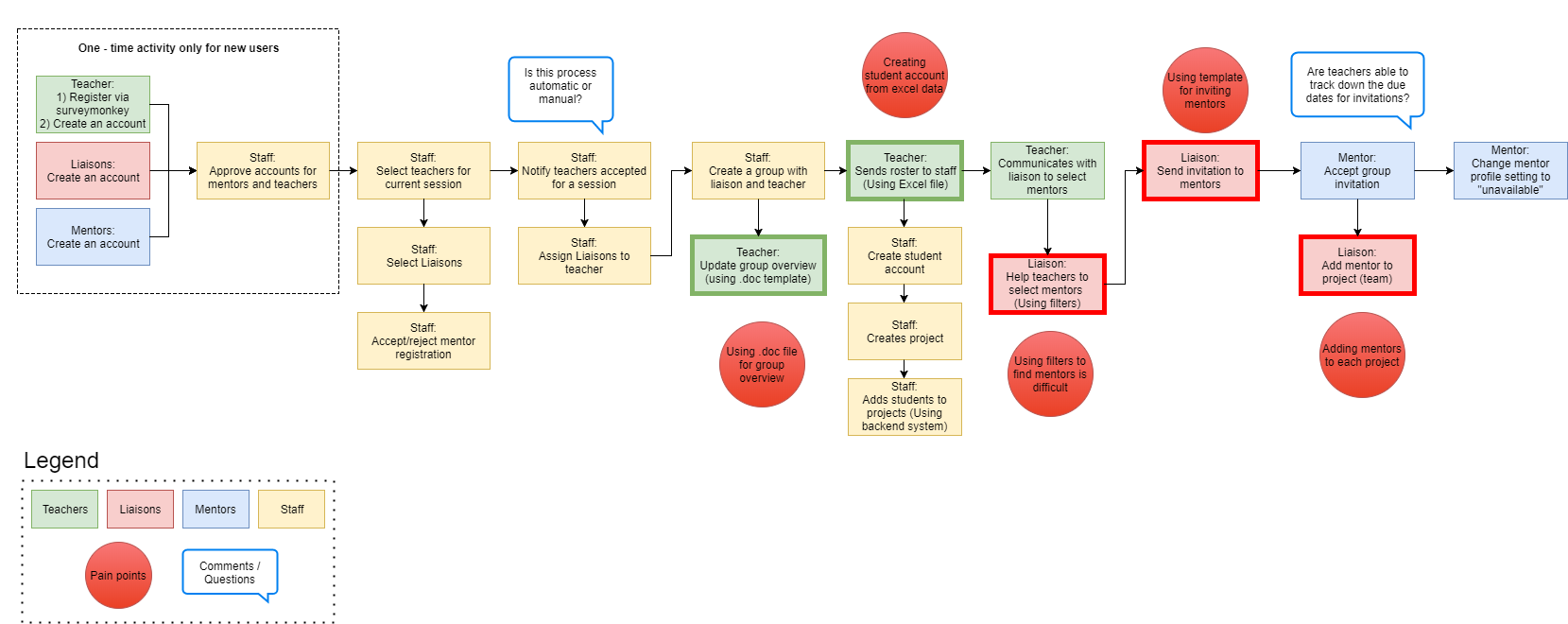
Task workflow for session setup in the website
Using Nielsen's usability heuristics, we evaluated the PlantingScience website and found several usability violations. We categorized our findings by key sections and tasks within the website. Some key findings from our heuristic evaluation are outlined below.
| Category | Problem identified | Recommended fix |
|---|---|---|
| Menus | Contrast between text and background is too low in forms. | Improve contrast between text and background to increase readability. |
| Create an account and Login | Text links for “Join as a Teacher" and “Become a mentor" are hard to identify. | Use visual elements like buttons for important links in the page. |
| Sign up form is too long and has an unconventional grouping of form fields | Create sections in the form such as “Personal Information", “Contact information" to provide visual separation between groups of form fields. | |
| Search | Search bar appears when a user hovers over the search icon and disappears on mouseout | Make the search bar static so it is easy for users to locate on the page. |
| There is no call-to-action button associated with the search bar; users have to hit the ENTER button on the keyboard to trigger the search. | Display a clickable search button which triggers the search. | |
| Collections | The collections page has unorganized tiled content and can be confusing to novice users. | Simplify the layout of the page, and allow users to customize what they can see in their collections. |
| Mentor Gallery | Dropdown filters in the mentor gallery are confusing and limit functionality to one filter per category. | Provide multiple filter options and use common conventions for applying filters. |
For the comparative analysis, we focused on three key features of the website that the PlantingScience team had the most trouble with. They wanted to understand how other similar websites implement features like creation of student accounts, grouping a large number of students into teams and searching for mentors. The following are the recommendations we presented to the PlantingScience team.
We surveyed sites like socrative.com, ck12.org, and powerschool.com which allow admin users (like teachers) to create accounts for underage users, by providing only the basic necessary information while maintaining student privacy.
For this functionality, we considered many sites which allow grouping and organizing of items, like Google Photos, Pandora, and Flickr to understand best practices for grouping content.
To improve the search and filter functions on the website, we looked at shopping websites like Amazon, Macy's and Best Buy to study how they implement filters.
Based on best practices from the competitive analysis result and the requirements put forth by the PlantingScience team, we designed new design mockups in Axure. The wireframes were used to present design ideas to the PlantingScience team for feedback, and test the new design with users.
Usability tests were conducted at the “Digging Deeper Together - A Model for Collaborative Teacher/Scientist Professional Development” workshop held at the Biological Sciences Curriculum Study (BSCS) center in Colorado Springs, CO. Five workshop attendees were asked to participate in the usability tests and asked to evaluate the mockups of the new design of the website. Each usability test was attended by one moderator and one observer.
By implementing our recommendations, the PlantingScience staff has been able to dramatically reduce the amount of training required for teachers and liaisons. It has also reduced the administrative burden of uploading and managing thousands of student accounts by placing control of student accounts in the hands of the teachers and liaisons. This has allowed the PlantingScience community to double in size.